Thursday, 12 March 2015

My Portraiture; Strangers in front of Strangers

I went to the local museum 'The Collection' to find some portraiture painting and asked strangers to choose their favourite painting and then I took their portrait in front of it. I didn't ask anyone to do anything in particular whilst I was taking their photo, I just wanted to see their reaction to the camera and the portraits. Here are my final 4 people and their portraits:

1. 

I found this woman interesting as she was very aware of the camera she asked if I wanted to take multiple shots of her from all angles and from different perspectives. I found this interesting as I liked the way she was attentive and got involved with the project. I also found it interesting how she chose her portrait as it took her a long time to choose which one was her favourite and then position herself ready for her photo. I chose the middle image as my final photo as I like the way she is looking partly at the photo and then at the same time into the camera as it shows she has an interest in both. I also like the facial expression she chose as it looks almost displeasing which is contrary to the way she acted when I asked her if she wanted her photo taken, which makes me wonder why she wanted to portray herself like that.
From a technical point of view I dislike the portrait as the lighting was very difficult to work with as the gallery was poorly lit so therefore the picture did not come out as sharp as I wanted it to making the picture less atheistic to look at. I do however like the distance from her to the painting as I feel you can easily see her and the painting .

2. 
My second picture was also interesting as this person wanted to have a picture with different portraits as he liked them both. I liked this as I got to try out different lighting, however it is still very dark. I like the first picture here as it goes with the rest of the collection as all the painting portraits have a wooded frame like this one, but I do not like the cropping of the photo as it cuts off the bottom of the frame. I should have turned the camera round and taken a portrait shot rather than landscape. Furthermore, the camera is pointing upwards towards the guy which isn't the best angle, I feel I should have taken it straight on to get a better over-all image. I do like this photo however as I feel this picture is more sharper than the others and more defined. I also feel as if the focus is on his face rather than the painting which is what I wanted. I also like the gap between the guy's head and the top of the photo as I feel this is enough head-room for the picture.


3.

I like both of these pictures as they are both different. I like the first picture as it is taken as a portrait and you get to see more of the guy in this one and I also like how he is standing in this picture as it makes it more formal and professional looking, however the frame of the painting is only straight when you look at it from certain angles. Furthermore the picture is very dark again, due to the lighting. The focus is on the painting rather than the person which is not what I wanted, which isn't a major matter but I would still prefer to have it on the subject. The second portrait is very different to the first as it features two paintings rather than one which gives the viewer more to look at, however I don't like the positioning of all the paintings and where he is standing as I feel it overcrowds the overall image and therefore draws the attention away from the subject. I do however like the lighting in this image as it's brighter than the others and makes the guy stand out but it still isn't enough to make him stand out completely. This is why I chose the first image. 

4. 

This ,an was acted different;y compared to other people that I approached as when he agreed to have his picture taken he demanded that he didn't want to look at the camera, so therefore I had to take a side shot of him. I liked this fact as it made me wonder what he was thinking when he's looking at the portrait behind him and I feel this is a good thing for the viewer to ponder.  However as the man wanted to take a different slant on things I had to change the camera settings but i didn't want him to be waiting for too long so therefore I think that the image isn't the best quality. I feel as if he isn't quite in focus but the background is making the image look blurry but I do like the composition of the image as it looks like he is looking into the eyes of the painting which makes the picture interesting. I feel this image is more thought-provoking rather than aesthetically pleasing and this is why I chose to use this picture. 


Overall I found it hard working with people as I panicked when it came to taking the pictures that I wouldn't have enough time to change the settings as I didn't want to keep people waiting. I also chose a location where the lighting was difficult to adjust and use to my advantage and this is why some of the pictures aren't to the best quality. I did however try to come up with an interesting concept and I would at some point like to re-do some of the portraits. 

Andrew Hobbs

Hobbs is a commercial photographer and does shoots for magazines. Even though I don't want to produce commercial style portraits, I like his style of lighting and how he asks his subjects to stand.


I really like the photo above due to the shadows produced by her hair across he face, it makes the shot more detailed and interesting. I also like the way he's represented his model as she is looking straight into the camera and on top of that she's standing towards the camera with her body facing it; this suggests that he's representing women powerful this is also further reinforced by her being the only one in the shot. I also like the contrast of the model compared to the background. As she is being lit by warm side lighting which enables a glowing feel the darkness of the background becomes more significant as it's hard to see what is behind her.

Saturday, 7 March 2015

Larry Towell- Portraiture

Towell produces images in 2015 from Bangladesh, Savar slum district Dhaka; of families holding a portrait photograph of family members who died in the Rana Plaza garment factory collapse. I found these portraits extremely moving and saddening but I was inspired by his confidence to ask the family members to take their photo with their deceased relative. I also liked the idea of incorporating a photography within a photo. I also admired his use of editing skills to make the overall pictures dimmer  to show loss and nostalgia. I also find the concept of taking photographs of taking pictures of lost  family members interesting as he wanted to show the impact of the factory collapsing not only to the business itself but to the remaining family members. Then he went on to take portraits of nearby factory workers in Dhaka, these images are just as saddening when you know that the nearby factory collapsed and then you see workers at the ages of 11 working in similar conditions.    

The overall project was inspiring as I would like to show the impact of change on people whilst showing their feelings and reactions to this change. I also liked how he incorporated the pictures of the deceased who caused this change in their lives, I would like to incorporate portraits within my project but take a different slant on the style compared to Larry Towell. 

Portrait influence Martin Parr

Whilst researching into portraiture and street photography I came across Martin Parr and ability to capture strangers in a every-day setting. I was inspired by advice he gave about street photography and then I saw it within his own work and then this helped me come up with my own idea.

1. Focus on sets, not individual images
For my set I want to use a museum or an art gallery where I can find portraits of people then take pictures of people in-front of them. This will mean I will have to think about the composition of the set for each photo and think where I can ask people to stand.

2. Make statements about society through your photographs 
For my statement I want to show how society has changed around the individual but that the original form of the human hasn't changed that much over time.  

3. Be obsessive
This means that you should take more than one photography and therefore take loads so that you can choose the best one rather than having to use a rubbish one.

4. Think outside the box
Meaning that the original idea should be something that nobody has tried or someone has but take a different slant on it. From what I have researched I can only find photos of artists stood in front of their work  or pictures of people with famous art work behind them. So therefore I hope this idea is different enough to work.

5. It is rare that you take a good photo
Following on from being obsessive, it is important to try and take as many photos as possible to get the best photo 

6. Find the extraordinary in the ordinary 
this means that by taking a picture which could be in an everyday location, it is your job as the artist to find something unique and different about that photo by for example asking strangers to put their slant on the photo by asking them to get involved.

7. Get Close
Getting close to people puts a different perspective on the photo for example their reaction could change and therefore the overall vibe of the photo might be different. Also by getting close the foreground becomes more dominant over the background and therefore also changing the perspective.

8. Exaggerate your photographs
“Part of the role of photography is to exaggerate”… Martin Parr. He elaborates in another interview: “With photography, I like to create fiction out of reality. I try and do this by taking society’s natural prejudice and giving this a twist.” this means that I will have to create a twist with portrature photography such as taking a single person and putting them in front of a picture of a person.

9. Don’t get people to smile
My aim is not to ask people to smile but just see what their natural reaction is to the camera and see how the react and compare it to different people's reactions.

10. Experiment 
I will experiment with different photos and different people as well as camera settings to create different photos and perspectives 

Thursday, 5 March 2015

Movement Pictures

I found this task very difficult as I was unsure of how to interpret different moving styles through the use of shutter speeds. After a lot of research into different photographers and their take on movement and discussion with friends and family I decided on using the 4 elements as the basic idea of my photos.
I then found it hard `to use different shutter speeds for each picture as I found using longer speeds outdoors let in too much natural light during the day so I only used the long shutter speeds at night and short-speeds during the day and outdoors.
Fire
Earth

Water
Air

Above are my element photos, you can see I used a mixture of inside and outdoor shots to try different shutter speeds. For example the 'Earth' photograph uses a quick shutter-speed of 1/750 to capture the movement of the car but it has a static background, I found it was more effective to use this shutter speed rather than 1/1000 because I seemed to miss a good positioning of the cars, I used a similar speed to capture the birds in the 'Air' photo, this also didn't capture the blur-motion of the sea-gulls which means the image is more crisp and defined. I did however use slower-shutter speeds of around 1/30 to capture the motion of the fire and water. I found focus on the background was important when taking the photo as if the background was blurry the whole image ended up being blurred, this is why I used a tripod. I prefer the fire image over water as I think its more interesting and shows better movement within the candles but I like how defined the drip of water actually is.


Wednesday, 25 February 2015

4 Elements and Movement

Whilst researching different types of movement in photography I came across Aliza Razell who used water-colour and photography mixed into one in her 365 project. watercolor9

 I really enjoyed her use of colour and space for example in her picture above there is a running colour scheme of oranges (seen in the clouds and wings) and also green (seen in the wings and ground) this is important in her photos as the use of colour ties in her water-colour with the photograph. I also like how the painting creates a sense of movement in her project and particularly this photo. This is because the wings suggest the initial static movement but then the extra dots around the wings imply that the girl is actually moving and you can see where she is moving to. The pose of the girl also reinforces this as her toes are pointing backwards and her arms are slightly out-stretched.

I was insipired by this project to think outside of the box when thinking of a concept for my images, I knew I wanted to include nature like Aliza Razell, however I know I'm not as good as painting like her, so I decided to use aspects of her projects like how she explored the use of the 4 elements in her work. This lead me to try different angles and perspectives on the elements. For example for air I did a high-angled shot of birds flying and a low angled shot of fire. Normally fire is seen as more powerful and dangerous than air and this juxtaposes my high angled and low angled shots.

EB Griffith

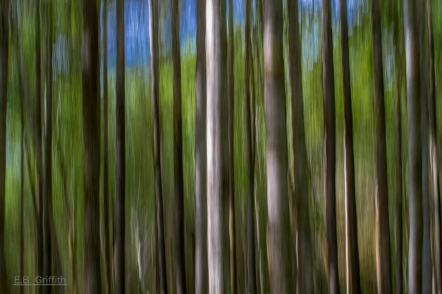
During a lecture we were shown a picture of trees using a slow shutter speed where the trunks were the main focus I really liked this take on photographing nature and trees so I went and researched it some more.
On photographer Griffith's blog he spoke about trying different shutter speeds to capture nature and trees included he used a 1/6 second speed with a medium amount of movement with the camera moving upwards. He spoke about not deviating from the course of the trees otherwise the photo would be a complete blur and there would be no definition.
Here is one of his photos:
Tree Blur - 70mm, 1/6, f/22

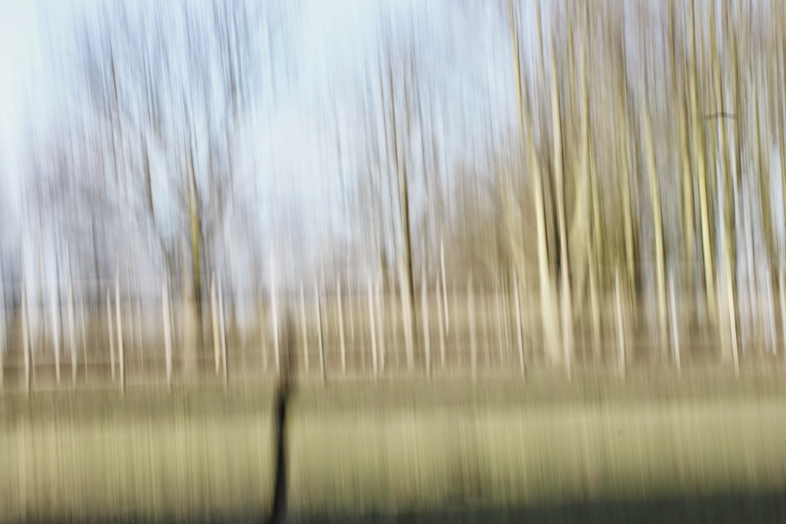
With all of this in mind I went try this technique out. I found that as it was a bright day the longer the shutter speed the more over exposed the shot became and then in consequence nothing was in focus. Griffith also mentioned using an upward motion but I found this tricky as I kept having too much sky in my shot and then not enough trees or too much ground and then again not enough tree, so then I tried a downward motion where I had the correct balance. I did find it very difficult to keep the trunks of the trees in focus as I was a long distance away from them so I had to keep changing the aperture and the lens focus to see what worked well. Overall I'm not sure if I'm 100% happy with my final shot, I would try and get closer to the trees next time and go on a darker day to try different shutter speeds and make other tree parts in focus and then see how it compares with my original shots. I ended up discarding this photo in my final four also because I felt when I went to re-shoot that I actually did not like these photos in the end and I felt as if I could've done better using a different subject matter however I did learn a lot from taking these photos forever getting the right aperture/ shutter speed when shooting outdoors and ensuring the camera is secure on the tripod. 


Final Shot


Over exposed and out of focus shot.