Sunday, 19 April 2015

My Final Photographs

I have looked at many photos within different news papers, and I liked the different approaches that photographers took within these news articles. Some took rather abstract perspectives on a simple stories. All of them however, tried to give the headline a visual story- this may be a positive narrative or negative. 
    With my pictures, I tried to show different angles and perspectives on the headline

'Beachwatch results show reduction in litter left on Suffolk’s shores'  which featured in East Anglian Daily Times in March 2015, for example I wanted to get empty clean beach space and promote the Suffolk shore-line, I also took pictures of  local fishermen enjoying the clean beaches. These photos were all also taken on the same set of coastline but just from different points. I found this interesting as from the photos I have taken do not show the similarity you would expect to see when taking pictures from the same place, as they all have different perspectives and thought-processes behind them.

This photo aims to represent the golden sands of the shore line, and the calmness of the sea. I chose to use a longer shutter speed to try and show the sea moving in a gentle manner. I do, however dislike the grey and dark sky as this does not promote the beaches as most people like to visit the coast on a sunny day.


The photo on the left represents the motion of the sea as it was taken using a slow shutter speed. I like how I captured the yacht in the background, as it makes the whole image more interesting, when taking the image I was worried the yacht might become a blur due to the use of a slow shutter speed, however I think it worked in my favour. I took the picture of the beach huts due to my research. The original image was rather soft due to it being partly out of focus, however in my post-production editing I did make the image sharper and therefore I kept it in my final images. I really like the bright colours of the beach huts, so I did try and boost them to make the image bolder and more vivid. I also wanted to include the sea and the beach in the image just to reinforce the idea that they are based on the beach and part of the rest of my series but keep the huts at the main focus.


I choose this image as I liked the composition of it, the fisherman staring out at the boat. I found it more thought provoking than promotional as he looks like he is in deep thought. This is partly the reason of why I initially changed the image into black and white to enhance the mystery of the photo, however after some deliberation I took the photo out of black and white because it didn't fit with the rest of the photos. This photo does also fit with the headline as it does show some rubbish next to the fisherman, which could show who were the culprates of unclean beaches.


This photo shows another beach in Felixstowe which is right next to the docks where many ships go. I decided to make the blue of the boat stand out more when editing as I thought this may make a good focal point for the image. I also captured fishermen's rods to the eright of the image to make better composition and balance the image. This image is quite dark however which I tried to overcome while editing but then the image became over exposed and too white. Out of the series this is my favourite image as I like the ship in the image because it adds more of a story to the series of images as well as adding variety. 

I wanted to have a simple image in my series which just showed the beach and the sea, a bit like Sugimoto's work. I thought it worked better when there was something stereotypical in the middle of the image such as the shore signs. I did try to make the green of the signs stand out more but this did not work as well as I planned. I think this image would have worked better if it was shot on a brighter day as, the sea and the sky would have blended more evenly like Sugimoto's series, also if I had the time would have liked to left the camera for  a longer period of time to capture the sea's movement and how it changes.

 If I was to re-do this article, I would take a whole different approach to the title. I wouldn't take it so literary, I would like to have more fun with the idea of beach clean-up. For example I would take a picture of a dirty beach and then manually on Photoshop edit all of the rubbish out and replace it with a golden beach or nicer scenery. I feel like this idea would have given my images more variety and would be more thought-provoking and it may even make a difference to beaches- however I do realise that this is a big ask. I would also ask people to get involved with my pictures   and get their views on rubbish on the beaches and then do a spin off on their ideas like Denise Felkin did.  


Thursday, 16 April 2015

Hiroshi Sugimoto


Hiroshi Sugimoto is  a Japanese photographer, he has spoken of his work as an expression of ‘time exposed’, which is photographs serving as a time capsule for a series of events in time. His work also focuses on transience of life, and the conflict between life and death.

I looked at his work called 'seascapes' which he produced in the 1980s, the photographs were taken over a period of 3hours roughly each from all corners of the world. I like this series due to the simplicity of each image, as in most of them all you can see is the sea and beach which are represented as different shades of grey. He captured his work on an old-fashioned large-format camera which was then transferred into black-and-white pictures, all exactly the same size, bifurcated exactly in half by the horizon line. I also liked the fact that they are all the same size as then the only thing different about them is just the detailing within the picture itself.

This is one of my favourite photos out of the series as I like the wave movement in the sea, as the colour contrasts with the dark grey clouds on a white background, I also like how the darkness of the edges draws your attention to the sea rather than the beach. Furthermore, I like how the shadows are cast on the sea and how this adds to the original movement I would like to in my series of pictures show the true nature of the sea, and how it can be calm and gentle with subtle wave movements, similar to the movement seen in this photograph.                                                                                                                        
I find this photo very interesting as I like how the colours blend into one at the middle, the sea is almost moving into the middle which adds a thought provoking element to the image. I also like how this image is not as contrasting as the previous image, this is because it is more subtle and there is not as much action within the image. I would like to use this in my series of images because I think it would add more context to the series as well as being more contrasting and diverse. 

Wednesday, 15 April 2015

Martin Parr's Beaches

Martin Parr looked at beaches across the world and I found his work on Benidorm the most interesting. I liked the way he used his telephoto lens to capture the true range and amount of people that visit this holiday destination.


I liked this photo as it shows the small amount of space between each person on the beach. I find this interesting as this is a true representation of what is actually happens during the summer months in Benidorm. I also enjoy how he has taken the photos from a different perspective, as all my other research has shown wide empty spaces of beach with a calm tide. Parr however, has shown a caotic side to the beaches by having a true representation.
The legs in the picture above could also mean that people come at different angles, which also then shows the busyness of the beach. 

I found this photo intriguing because of the amount of people you can see on the beach, which gives you a lot to look at and focus on. I like this fact as you notice different things every time you look at it, which is a nice effect. I feel that this picture goes well with the other one as they both show the vast amount of people which all gather in this holiday resort, as well as the similar demographic of people who visit. I also enjoy the depth of field used in this photo as it shows off the different layers of people well, and it adds more texture to the image.   

I will take from this set of images the different perspectives of beaches which may be from different angles or from someone else's different views. I  will also consider how the series of photos go together, like Parr's focuses on the people and the space, I might focus on the beach itself or just one particular beach. 

Thursday, 9 April 2015

Similar Articles


I have looked over many articles to try and take photos on and I found one about local beach clean ups in my home county of Suffolk. I then looked at similar beach related articles to gather ideas about beach photography.  One article I looked at was about Britain's best beaches so it aims to promote the place and the sands.
Britain's best beaches

I liked this picture due to the post-production work, for example I like how the photographer boosted the colour on the beach-hut doors to make them look even more colourful and brighter. I feel that this is important when it comes to promotion of Saunton Sands, Devon; as if it was a  a dull day people are not likely to visit. I also like how it is made to look like a foreign beach to make it look exotic and not a  standard British beach, which is also done to try and sell the beach to the picture's audience. I like the composition of the photo too, and how the beach huts are going off into the distance suggesting the beach and it's huts are going on for miles. The clouds also play an important role in the image as they are made to look fluffy to try and get an aesthetic view on the beach, however in the original picture they may have been thick letting in little sunlight but the edited version does not suggest this.

I tried to re-create this shot, as I really liked the way it showed off true British beaches and what is iconic about them. Here is my unedited photo:
I tried to show the right balance of huts and beach so that the whole concept of the news article (cleaner beaches) as well as the stereotypical view of British beaches were included.  I feel that this picture needs brighting up so the beach hut's colour are bolder and brighter which will make this image more appealing to try and promote the Suffolk coastline. I do however think  that this image shows that the beaches are cleaner and therefore will encourage tourists to come to the coast, if the post-production is successful. 

The second article I looked at was about the cleanest beaches in Britain which is extremely similar to my chosen article. Most of the pictures focused on getting the wider angle to capture the whole stretch of beach, this shows that the beaches are clean and puts  them in a lovely perspective. For example: 
Britain's cleanest beach

This picture shows the beach of Ferring. I like this photo due to the placement of the boat in the foreground, it shows off the true British beach because it shows the heritage of Britain. It also intises people to visit Ferring due to the blue skies and long coast line, as stereotypically this is what people look for in a holiday destination along the coast. From this picture I have taken that journalistic photographs are taken to promote the place and make people want to go there, and I tried to do this when taking my pictures.
For example:


This photo shows a empty, clean and sandy Suffolk beach with a calm sea. I believe that most people will want this when they visit the sea side. This picture however does not show a blue sky like the other one, which may be a fault. I tried to make the sand more golden in post-production this is also because I wanted my photos to promote the Suffolk coast line, however this did result in the sea looking more grey and the sky becoming slightly more black, but this was due mainly the original photos as I took it on a gloomy day. If I was to re-shoot this set of photographs, I would try to go on a sunnier day, which will help my photographs become more atheistic and promotion worthy. I would also try to show the whole coastline running down the beach rather than cutting it off and I would also try looking at the beach from a lower angle to show the beach from another perspective and to make the photo more interesting. 

Friday, 3 April 2015

Denise Felkin

Denise is a photojournalist and has recently done some work for the BBC, she has done many projects on certain protests and the most recent example is why certain people decide not to vote. Her images capture their thoughts of why they don't vote and then the images is then further reinforced by captions below stating why they don't vote. 

Sammy
"It does not matter how much you scream and shout, they won't listen to us." Sammy, 30, Brighton
I feel this image goes well with the caption as there is no camera-angle towards the subject as it's straight on, this means that the person in the image has the same amount as power as anyone. I feel this is important as the caption suggests that we have less power compared to the government however this image suggests differently. I also like how Sammy is standing as it suggests she is looking for someone to help or for someone to listen like the caption also suggests. The mise-en-scene in this image builds a picture of who she is and where she's from. This is important as you get to know her character and therefore the audience gets to know their character better, which then the viewers will understand even more why she doesn't want to vote.Furthermore, the sign stating that their is CCTV also reinforces her caption as she is being watched but not listened to which is important to getting her point across. Denise Felkin also asked her subjects to wear their own clothes which is important as then she was not changing her subject's identity, which gives an even better portrayal of her subjects.
    Overall I think that is a very strong image which will goes hand in hand which the caption which the image is built up on. I feel that the effect put onto the image lights the scene well as it amplifies the shadows over her face which suggests she doesn't get listened to.

Tuesday, 31 March 2015

Paul Grover

Grover is a photographic journalist for the Times newspaper he has done features about last years floods; he took an  interesting view trying to capture the hight and width of the waves as it crashed over a sea wall in North Devon: Homes have been evacuated in coastal areas as Britain braces for dangerous flooding as severe winds sweep in from the Atlantic.

The Environment Agency has issued 21 of its most serious flood warnings advising of flooding and a risk to life across Wales and England.

I liked this image as you can almost see the houses bracing themselves before the wave hits. I also liked how he managed to capture the varsity and magnitude of the wave as  it rises in the air. I feel that this picture does portray the whole story as it shows how bad the storms were as they first start to hit the towns and villages along the coast, plus it does also show what these towns looked like before the storm hit. 

He has also done other articles such as David Cameron accepting leader ship;

I enjoy the hierarchy of this image as the high angle portrays David Cameron as having power, as now he does due to him now in this photography becoming Prime Minister. I also like how he managed to capture the moment where he goes to shake The Speaker's hand, as this is a very important time . I also like the shadows in the background as it also shows the handshake, but from a different angle and viewpoint. I feel that this picture does capture the story of David Cameron winning the election well as it shows his immediate power and leadership. However, I feel as if The Speak should be included within the shot as he does play an important role in the scenario and therefore he should be seen in the shot and not just his shadow.

Photographic Journalists- Corey Arnold

Corey Arnold is a photojournalist who is mainly dedicated to capturing fisherman at work.


Corey was one of the fisherman's in the Bering Sea, at the time when jobs were scarce and he took his pictures during breaks and when storms began, his photos were then published as a monograph by Nazraeli press in 2011. 

I enjoyed the series of pictures as I found you got a real sense of what it's like to be a fisherman and their emotional journey they went through to catch these crabs.  I like how he captured the motion of the storms for example in the 3rd photo. Using a fast shutter speed meant he could capture the full blast of the wave against the fisherman and I found this very effective. I also like how the white background contrasts with the fisherman's suit, this makes him stand out and become the focal point of the image. The second image shows how many crabs do get caught and you can almost see the relief in the man's face that they caught enough which I think is important to tell a story behind the image. I also liked the dark ages around the main image to give a better focal point of the crabs which also focuses the detail of them.


Thursday, 12 March 2015

My Portraiture; Strangers in front of Strangers

I went to the local museum 'The Collection' to find some portraiture painting and asked strangers to choose their favourite painting and then I took their portrait in front of it. I didn't ask anyone to do anything in particular whilst I was taking their photo, I just wanted to see their reaction to the camera and the portraits. Here are my final 4 people and their portraits:

1. 

I found this woman interesting as she was very aware of the camera she asked if I wanted to take multiple shots of her from all angles and from different perspectives. I found this interesting as I liked the way she was attentive and got involved with the project. I also found it interesting how she chose her portrait as it took her a long time to choose which one was her favourite and then position herself ready for her photo. I chose the middle image as my final photo as I like the way she is looking partly at the photo and then at the same time into the camera as it shows she has an interest in both. I also like the facial expression she chose as it looks almost displeasing which is contrary to the way she acted when I asked her if she wanted her photo taken, which makes me wonder why she wanted to portray herself like that.
From a technical point of view I dislike the portrait as the lighting was very difficult to work with as the gallery was poorly lit so therefore the picture did not come out as sharp as I wanted it to making the picture less atheistic to look at. I do however like the distance from her to the painting as I feel you can easily see her and the painting .

2. 
My second picture was also interesting as this person wanted to have a picture with different portraits as he liked them both. I liked this as I got to try out different lighting, however it is still very dark. I like the first picture here as it goes with the rest of the collection as all the painting portraits have a wooded frame like this one, but I do not like the cropping of the photo as it cuts off the bottom of the frame. I should have turned the camera round and taken a portrait shot rather than landscape. Furthermore, the camera is pointing upwards towards the guy which isn't the best angle, I feel I should have taken it straight on to get a better over-all image. I do like this photo however as I feel this picture is more sharper than the others and more defined. I also feel as if the focus is on his face rather than the painting which is what I wanted. I also like the gap between the guy's head and the top of the photo as I feel this is enough head-room for the picture.


3.

I like both of these pictures as they are both different. I like the first picture as it is taken as a portrait and you get to see more of the guy in this one and I also like how he is standing in this picture as it makes it more formal and professional looking, however the frame of the painting is only straight when you look at it from certain angles. Furthermore the picture is very dark again, due to the lighting. The focus is on the painting rather than the person which is not what I wanted, which isn't a major matter but I would still prefer to have it on the subject. The second portrait is very different to the first as it features two paintings rather than one which gives the viewer more to look at, however I don't like the positioning of all the paintings and where he is standing as I feel it overcrowds the overall image and therefore draws the attention away from the subject. I do however like the lighting in this image as it's brighter than the others and makes the guy stand out but it still isn't enough to make him stand out completely. This is why I chose the first image. 

4. 

This ,an was acted different;y compared to other people that I approached as when he agreed to have his picture taken he demanded that he didn't want to look at the camera, so therefore I had to take a side shot of him. I liked this fact as it made me wonder what he was thinking when he's looking at the portrait behind him and I feel this is a good thing for the viewer to ponder.  However as the man wanted to take a different slant on things I had to change the camera settings but i didn't want him to be waiting for too long so therefore I think that the image isn't the best quality. I feel as if he isn't quite in focus but the background is making the image look blurry but I do like the composition of the image as it looks like he is looking into the eyes of the painting which makes the picture interesting. I feel this image is more thought-provoking rather than aesthetically pleasing and this is why I chose to use this picture. 


Overall I found it hard working with people as I panicked when it came to taking the pictures that I wouldn't have enough time to change the settings as I didn't want to keep people waiting. I also chose a location where the lighting was difficult to adjust and use to my advantage and this is why some of the pictures aren't to the best quality. I did however try to come up with an interesting concept and I would at some point like to re-do some of the portraits. 

Andrew Hobbs

Hobbs is a commercial photographer and does shoots for magazines. Even though I don't want to produce commercial style portraits, I like his style of lighting and how he asks his subjects to stand.


I really like the photo above due to the shadows produced by her hair across he face, it makes the shot more detailed and interesting. I also like the way he's represented his model as she is looking straight into the camera and on top of that she's standing towards the camera with her body facing it; this suggests that he's representing women powerful this is also further reinforced by her being the only one in the shot. I also like the contrast of the model compared to the background. As she is being lit by warm side lighting which enables a glowing feel the darkness of the background becomes more significant as it's hard to see what is behind her.

Saturday, 7 March 2015

Larry Towell- Portraiture

Towell produces images in 2015 from Bangladesh, Savar slum district Dhaka; of families holding a portrait photograph of family members who died in the Rana Plaza garment factory collapse. I found these portraits extremely moving and saddening but I was inspired by his confidence to ask the family members to take their photo with their deceased relative. I also liked the idea of incorporating a photography within a photo. I also admired his use of editing skills to make the overall pictures dimmer  to show loss and nostalgia. I also find the concept of taking photographs of taking pictures of lost  family members interesting as he wanted to show the impact of the factory collapsing not only to the business itself but to the remaining family members. Then he went on to take portraits of nearby factory workers in Dhaka, these images are just as saddening when you know that the nearby factory collapsed and then you see workers at the ages of 11 working in similar conditions.    

The overall project was inspiring as I would like to show the impact of change on people whilst showing their feelings and reactions to this change. I also liked how he incorporated the pictures of the deceased who caused this change in their lives, I would like to incorporate portraits within my project but take a different slant on the style compared to Larry Towell. 

Portrait influence Martin Parr

Whilst researching into portraiture and street photography I came across Martin Parr and ability to capture strangers in a every-day setting. I was inspired by advice he gave about street photography and then I saw it within his own work and then this helped me come up with my own idea.

1. Focus on sets, not individual images
For my set I want to use a museum or an art gallery where I can find portraits of people then take pictures of people in-front of them. This will mean I will have to think about the composition of the set for each photo and think where I can ask people to stand.

2. Make statements about society through your photographs 
For my statement I want to show how society has changed around the individual but that the original form of the human hasn't changed that much over time.  

3. Be obsessive
This means that you should take more than one photography and therefore take loads so that you can choose the best one rather than having to use a rubbish one.

4. Think outside the box
Meaning that the original idea should be something that nobody has tried or someone has but take a different slant on it. From what I have researched I can only find photos of artists stood in front of their work  or pictures of people with famous art work behind them. So therefore I hope this idea is different enough to work.

5. It is rare that you take a good photo
Following on from being obsessive, it is important to try and take as many photos as possible to get the best photo 

6. Find the extraordinary in the ordinary 
this means that by taking a picture which could be in an everyday location, it is your job as the artist to find something unique and different about that photo by for example asking strangers to put their slant on the photo by asking them to get involved.

7. Get Close
Getting close to people puts a different perspective on the photo for example their reaction could change and therefore the overall vibe of the photo might be different. Also by getting close the foreground becomes more dominant over the background and therefore also changing the perspective.

8. Exaggerate your photographs
“Part of the role of photography is to exaggerate”… Martin Parr. He elaborates in another interview: “With photography, I like to create fiction out of reality. I try and do this by taking society’s natural prejudice and giving this a twist.” this means that I will have to create a twist with portrature photography such as taking a single person and putting them in front of a picture of a person.

9. Don’t get people to smile
My aim is not to ask people to smile but just see what their natural reaction is to the camera and see how the react and compare it to different people's reactions.

10. Experiment 
I will experiment with different photos and different people as well as camera settings to create different photos and perspectives 

Thursday, 5 March 2015

Movement Pictures

I found this task very difficult as I was unsure of how to interpret different moving styles through the use of shutter speeds. After a lot of research into different photographers and their take on movement and discussion with friends and family I decided on using the 4 elements as the basic idea of my photos.
I then found it hard `to use different shutter speeds for each picture as I found using longer speeds outdoors let in too much natural light during the day so I only used the long shutter speeds at night and short-speeds during the day and outdoors.
Fire
Earth

Water
Air

Above are my element photos, you can see I used a mixture of inside and outdoor shots to try different shutter speeds. For example the 'Earth' photograph uses a quick shutter-speed of 1/750 to capture the movement of the car but it has a static background, I found it was more effective to use this shutter speed rather than 1/1000 because I seemed to miss a good positioning of the cars, I used a similar speed to capture the birds in the 'Air' photo, this also didn't capture the blur-motion of the sea-gulls which means the image is more crisp and defined. I did however use slower-shutter speeds of around 1/30 to capture the motion of the fire and water. I found focus on the background was important when taking the photo as if the background was blurry the whole image ended up being blurred, this is why I used a tripod. I prefer the fire image over water as I think its more interesting and shows better movement within the candles but I like how defined the drip of water actually is.


Wednesday, 25 February 2015

4 Elements and Movement

Whilst researching different types of movement in photography I came across Aliza Razell who used water-colour and photography mixed into one in her 365 project. watercolor9

 I really enjoyed her use of colour and space for example in her picture above there is a running colour scheme of oranges (seen in the clouds and wings) and also green (seen in the wings and ground) this is important in her photos as the use of colour ties in her water-colour with the photograph. I also like how the painting creates a sense of movement in her project and particularly this photo. This is because the wings suggest the initial static movement but then the extra dots around the wings imply that the girl is actually moving and you can see where she is moving to. The pose of the girl also reinforces this as her toes are pointing backwards and her arms are slightly out-stretched.

I was insipired by this project to think outside of the box when thinking of a concept for my images, I knew I wanted to include nature like Aliza Razell, however I know I'm not as good as painting like her, so I decided to use aspects of her projects like how she explored the use of the 4 elements in her work. This lead me to try different angles and perspectives on the elements. For example for air I did a high-angled shot of birds flying and a low angled shot of fire. Normally fire is seen as more powerful and dangerous than air and this juxtaposes my high angled and low angled shots.

EB Griffith

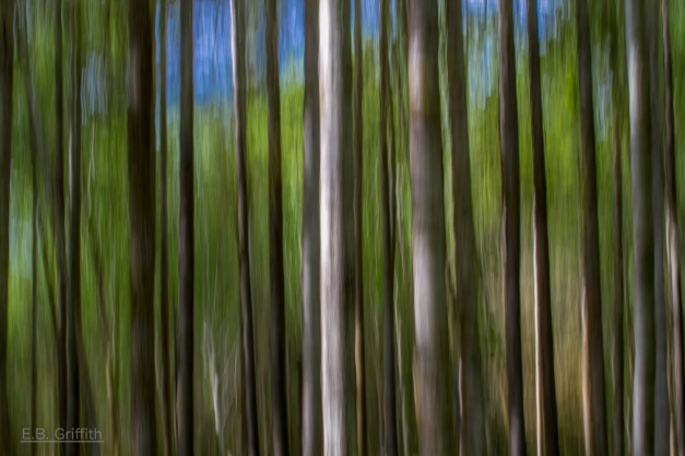
During a lecture we were shown a picture of trees using a slow shutter speed where the trunks were the main focus I really liked this take on photographing nature and trees so I went and researched it some more.
On photographer Griffith's blog he spoke about trying different shutter speeds to capture nature and trees included he used a 1/6 second speed with a medium amount of movement with the camera moving upwards. He spoke about not deviating from the course of the trees otherwise the photo would be a complete blur and there would be no definition.
Here is one of his photos:
Tree Blur - 70mm, 1/6, f/22

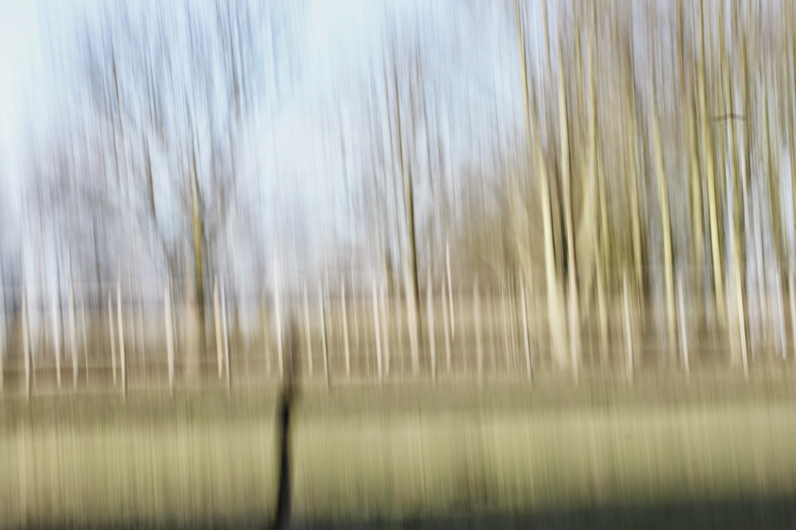
With all of this in mind I went try this technique out. I found that as it was a bright day the longer the shutter speed the more over exposed the shot became and then in consequence nothing was in focus. Griffith also mentioned using an upward motion but I found this tricky as I kept having too much sky in my shot and then not enough trees or too much ground and then again not enough tree, so then I tried a downward motion where I had the correct balance. I did find it very difficult to keep the trunks of the trees in focus as I was a long distance away from them so I had to keep changing the aperture and the lens focus to see what worked well. Overall I'm not sure if I'm 100% happy with my final shot, I would try and get closer to the trees next time and go on a darker day to try different shutter speeds and make other tree parts in focus and then see how it compares with my original shots. I ended up discarding this photo in my final four also because I felt when I went to re-shoot that I actually did not like these photos in the end and I felt as if I could've done better using a different subject matter however I did learn a lot from taking these photos forever getting the right aperture/ shutter speed when shooting outdoors and ensuring the camera is secure on the tripod. 


Final Shot


Over exposed and out of focus shot.

Daniel Crooks- Movement


Daniel Crooks filmed a man performing Tai Chi and then replayed it back to get this image which is called Static no.12 (seek stillness in movement) done in 2009-10. I like this photo because I found it really interesting to capture this type of movement in a still image as I have never seen it so clearly done. I enjoy the fact that you can see all of his body in each movement the man performs for example in the second movement you can't see his legs but you can see his body. I also find the image quite natural as Crooks took and image of a man in a park just going about his normal routine rather than bringing someone to a location and telling them to perform Tai Chi. However Crooks did have to rearrange the original movement to create the final photograph which would explain how he created the fluid movement whilst being so clear.


I took inspiration from Crooks by taking a photo of a person moving. In my picture you see somebody jumping in which the movement is captured in the mid air. I feel as if the picture could have been better if I used a longer shutter speed to create a picture of the full movement like Crooks did. I do like my photo however as it has a long depth of field which means the background of the trees are all in focus compared to the movement. If I were to re-take the image again I would shoot it in the dark and use a spot light on the action. This will then allow me to capture the full motion of the jump as well as having the main focus on the movement. I would also ensure that the whole of the girl is in the picture meaning her hand would not be out of shot, this could have easily be done by expanding the tripod but I found it difficult to judge how high she could jump as it varied each time.

I chose this shot over this shot because I felt it captured more of the motion of her movement and it was in better focus. I also liked the shot of the background in the top image over the bottom. 

However I did later decide not to use this picture in my final choice as I felt that the blur in the picture was unprofessional and I felt as if I could do better. I also did not like the fact that the countryside behind the 'jumper' was slanted so therefore I discarded the photo and chose another one to represent earth.


Found Object Final

Here is my first draft final triptych for the found object project:
The last straw standing

I have decided to use the same objects in each picture and then re-organise them into an almost story telling order showing how at first you are strangers then the connection and then the loss.
     The triptych was taken on a white background which is creased, I decided to keep the background creased to show and reinforce the dirtiness of the objects (as I found them on the floor) by not having a  perfectly pristine image. Furthermore I also added the black and white filter to add to the'dirty' effect in the triptych.
      I also tried to include strong shadows which formed on the white background, I decided this after I researched into still life photography. I liked the way how objects stand out even more when there is a shadow behind them. I feel as if the shadows have worked well within the images as they have added to the overall tone and enhanced the objects, as the shadows are so prominent. 
     I feel as if the third image is the least strong as it is not entirely in focus compared to the other two images, I think I could've focused the 'VK' bottle top better which would've made the whole image stronger as a three. I like the middle image the best as I think the gleam one the top of the straws are a good focal point for the whole image as a three. I also think the middle image has the best shadow as it's just off the middle which can be easily seen by the viewer. The bottle top is also in a prime position to be seen and it is lit up due to the direction of the light being directly aimed towards it.

Friday, 13 February 2015

Stephanie Gonot


When researching modern still life photography I came across Stephanie Gonot's work. I became inspired by the use of colour in her photographs and the way she brought the objects away from their conventional places in life. For example in one of her images she captured cereal spilling around a bowl, but instead of keeping it in a bowl she placed the in grass instead. I  liked this concept because it gave the viewer more to think about when looking at her work and it produced a lasting thought about her work. I also enjoyed her image of jewellery on a concrete style background, this again is an example of taking everyday objects and placing them somewhere you might not expect to find them. The grey of the concrete makes the image almost 3D because it allows the shadows to create a visual where the objects look like they are being pushed upwards which is a enjoyable and creative technique. I also like the fact that this background lets the colours and the shape of the jewellery be prominent which is important when it comes to commercial- still life photography as the picture is there to sell, even though my picture will not be selling anything, it is still important to ensure that the main object of the photo doesn't get lost into the background. Furthermore I found  photograph using the stripy background interesting as I wouldn't have thought about choosing a patterned background, however when I tried to use this idea you could barely see my objects as the background was too over powering; the bike and guitar in her pictures are rather big and this is why her placement works. I was also inspired by the way the objects were placed onto the background; for example they are straight and in normal positions that the objects would be seen in everyday.


 Here is some of my attempts taken from the idea of taking found objects and moving them to a different place where you wouldn't expect to find them. I tried to create my own studio by using a white pillow case which was creased. I kept the creases in the pillow case to add texture like Stephanie Gonot's photo where she had a gravel-like back drop. Her images are also full of colour which, resembles the objects in her pictures such as cereal which is naturally colourful; my objects on the other hand are not naturally colourful so this is why I went for a colour scheme of black and white whereas she enhanced the natural colours.